Every Shopify store owner with a conversion problem does the same thing. They Google it. They get the same article fifty times: add trust badges, speed up your site, fix your checkout, stick a popup on exit. They implement all of it. Nothing moves.
That’s because a conversion rate is a symptom, not a diagnosis. Treating a 1.4% conversion rate without knowing where the drop-off happens is like taking painkillers for a broken leg. You feel productive. You’re not.
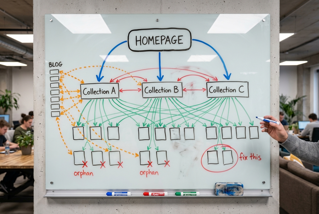
Before you change a single pixel, figure out which layer of the funnel is broken. There are three. Each one has a different fix entirely.
The Three-Layer Diagnostic
Open your Shopify analytics and pull these three numbers:
- Layer 1: Traffic to product page view rate. What percentage of visitors look at a product? If most bounce before they see a single product page, your store isn’t the problem. Your traffic is.
- Layer 2: Product view to add-to-cart rate. The average Shopify store converts 4.6% of product page views into add-to-carts. Top 10% hit 9.6% or higher. Below 3%, something is repelling buyers.
- Layer 3: Add-to-cart to purchase rate. If people are adding to cart but not buying, the problem lives between the cart and the thank-you page. Nowhere else.
Most stores we audit have never separated these three numbers. They’re staring at one blended conversion rate and guessing. Stop guessing. Diagnose. Then read the section below that matches where your funnel is bleeding.

Layer 1: Stop Throwing Good Money After Bad Traffic
If your traffic-to-product-view rate is low, your store is fine. Your audience isn’t.
We audited a store last year that was convinced they needed a full redesign. Their conversion rate was 1.1% and dropping. When we segmented by traffic source, the picture changed entirely. Instagram ads were driving 40% of their traffic at a 0.6% conversion rate. Organic search was driving 15% of their traffic at 4.1%. Same store. Same products. Same checkout. The only difference was who was landing on the site.
The maths makes this uncomfortable:
- 10,000 wrong visitors at 0.5% conversion = 50 sales
- 3,000 right visitors at 3% conversion = 90 sales
Fewer visitors, nearly double the revenue. That store didn’t need a redesign. It needed to stop lighting money on fire with broad-match social ads and double down on the channels sending people who were ready to buy.
The difference comes down to intent. Someone who Googles “merino hiking socks NZ” has their wallet half-open. Someone who sees your ad while scrolling TikTok at 11pm does not. Both count as “traffic” in your analytics, but they’re not the same thing. And when you blend them into one conversion rate, you can’t tell which one is dragging you down.
How to diagnose this:
- In Shopify Analytics, break down conversion rate by traffic source. If one channel converts at 4x the rate of another, your store isn’t broken. Your traffic mix is
- Check your bounce rate by source. If paid social bounces at 70%+ while organic search bounces at 30%, those paid visitors are leaving before they see a single product
- Before spending a cent on CRO tools, run the numbers on what happens if you shift 20% of your ad budget from your worst-converting channel to your best. That single move often does more than any on-site change
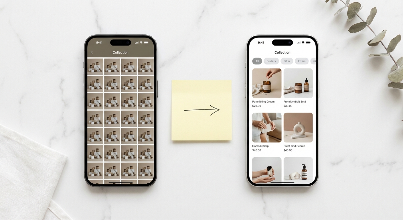
Layer 2a: Your Collection Pages Are a Product Dump, Not a Shopping Experience
Your visitors aren’t lazy. They’re overwhelmed.
If your add-to-cart rate is below 3%, visitors are seeing products and deciding not to engage. One of the most common reasons (and one that almost never appears in CRO advice) is that your collection pages are paralysing them with choice.
Most Shopify stores treat collection pages as a warehouse. Thirty, fifty, sometimes 100+ products dumped into a grid with default sorting and no guidance. It looks fine to the store owner because they know every product. To a first-time visitor, it’s a wall of choices with no way in. (We wrote a full guide to optimising collection pages for both SEO and conversions.)
The research on this is definitive. Columbia University’s famous jam study found that when shoppers saw 24 options, 3% bought. When shown 6 options, 30% bought. Ten times the conversion rate from fewer choices. More recent ecommerce data shows conversion peaks at four to six options per view. Beyond seven to nine options without filtering, measurable cognitive fatigue kicks in, satisfaction drops, and abandonment spikes.
Yet only 16% of major ecommerce sites provide a good filtering experience. 42% lack category-specific filters entirely. One retailer saw a 26% jump in conversions just from implementing product filters. Another got a 30% boost from smart default sorting. These aren’t incremental gains. This is found money.
How to fix this:
- Add category-specific filters. A clothing collection needs size, colour, and occasion. A supplements collection needs goal, ingredient, and dietary restriction. Generic “sort by price” doesn’t cut it
- Curate your default sort order. Alphabetical is lazy. Lead with bestsellers or highest-rated products. Your default order is a merchandising decision, so treat it like one
- Break large collections into smaller, intent-specific ones. “Running Shoes for Wide Feet” converts better than “All Shoes” because the decision is already partly made. This sub-collection strategy also captures long-tail SEO traffic you’re currently missing
- If you can’t reduce the number of products, at least reduce the feeling of overwhelm. Featured picks, “staff favourite” badges, and curated rows inside the collection page all give visitors a starting point

Layer 2b: Your Footer Is Where Sales Go to Die
Your add-to-cart rate is still low, and you’ve fixed your collection pages. So where’s the leak? Somewhere you’ve never thought to look: your return policy.
82% of online shoppers check the return policy before they buy. Not after. Before. And 48% abandon their cart if the policy is unclear, buried, or hostile. That’s not a footnote. That’s half your potential customers walking away because of a page you wrote in ten minutes and never looked at again.
Most Shopify stores stuff their return policy into a footer link that opens a wall of legal text. Some don’t surface one at all. Your footer is where sales go to die, because the people who need reassurance most (first-time buyers) are the ones who will go looking for it. And if what they find is three paragraphs of exclusions and conditions, they’re gone.
Here’s where most store owners get it backwards. Research from the University of Colorado found that stores with more generous return policies experience lower return rates. Not higher. Lower. A longer return window triggers the endowment effect: the longer someone has a product, the more attached they become. Restrictive policies create anxious buyers who second-guess themselves the moment the package arrives.
How to fix this:
- Surface a one-liner like “Easy returns within 30 days” on every product page, right below the Add to Cart button. Link it to the full policy. Nobody reads a wall of legal text mid-purchase, but a single reassuring line at the point of decision does the heavy lifting
- Write it in plain language, not legal language. “Free returns within 30 days, no questions asked” converts. Three paragraphs of exceptions does not
- Consider extending your return window. Sounds reckless. The data says the opposite. Stores that move from 14-day to 30-day windows consistently see conversions rise and returns stay flat or drop
- Highlight the return policy in your checkout flow too. Reassurance at the point of payment is one of the cheapest, highest-impact checkout changes you can make
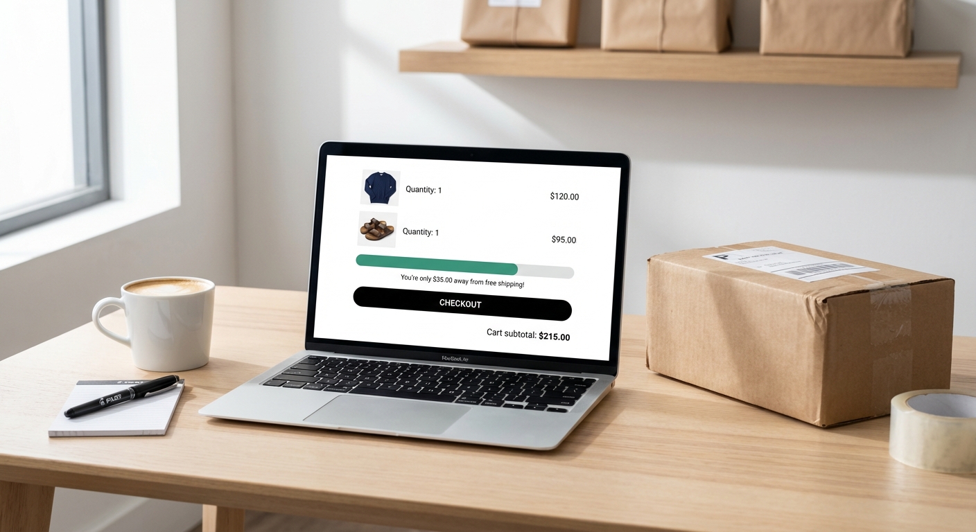
Layer 3: Free Delivery Isn’t a Cost. Paid Delivery Is.
Your add-to-cart rate is healthy but people are dropping off between cart and purchase. This is Layer 3, and one issue towers above everything else: surprise delivery costs are the number one reason people abandon checkout. Not number three. Not “one of the top reasons.” Number one. Baymard Institute puts it at 55% of all checkout abandonments.
Most stores know this. What they get wrong is the response. Run the numbers on your own store: if you’re doing 1,000 add-to-carts a month and 55% abandon over delivery costs, that’s 550 people who wanted to give you money and you turned them away at the door.
The lazy approach is to slap “Free shipping over $100” in the announcement bar and call it done. But the gap between what retailers set as a threshold and what customers will spend to qualify is $21 on average. Retailers set thresholds at $64. Customers will stretch to $43. Set it too high and you’ve just added another reason to abandon.
The smart approach is to treat delivery as a conversion tool, not a cost centre.
Companies with free shipping convert at 20% higher rates than those without. In the NZ and Australian market, this effect is even more pronounced. 66% of ANZ shoppers would rather wait up to two weeks than pay for shipping. One Australian retailer saw a 62.86% conversion lift from switching to free shipping. Another saw orders increase by 90% after introducing a properly calibrated free shipping threshold.
Here’s the play: set your threshold 15-25% above your current AOV. Not 50% above. Not double. Just enough to nudge the average cart up without creating an unreachable barrier. Then put a progress bar in the cart: “You’re $23 away from free delivery.” 58% of shoppers will add items to qualify, which drives a roughly 30% increase in average order value.
How to fix this:
- Show delivery cost on the product page, not at checkout. No surprises. Ever. If delivery is $7, say so upfront. If it’s free over a threshold, say that too
- If you can’t afford free shipping on everything, build it into your pricing. A $47 product with free shipping converts better than a $40 product with $7 shipping, even though the customer pays the same amount. This isn’t a theory. It’s been tested over and over
- For NZ/AU stores: show GST-inclusive pricing. Tax surprises at checkout are an instant abandonment trigger in markets where inclusive pricing is the norm
- Run the numbers. If free shipping costs you $6 per order but increases conversion by 20% and AOV by 15%, you’re not losing margin. You’re buying revenue. Most store owners have never done this calculation
Stop Guessing. Start Diagnosing.
The difference between a 1% conversion rate and a 3% conversion rate isn’t design talent or a bigger marketing budget. It’s knowing which of the three layers is broken and fixing that specific thing instead of following a generic checklist.
Layer 1 broken? Your traffic is the problem. Stop throwing good money after bad traffic and reallocate to channels that send buyers, not browsers.
Layer 2 broken? Your collection pages are overwhelming people, or your return policy is invisible. Fix the experience between landing and add-to-cart.
Layer 3 broken? Delivery costs are killing you at the finish line. Do the maths on free shipping properly. It’s almost certainly cheaper than the sales you’re losing.
Measure. Diagnose. Fix the right thing. Then measure again.
The average Affilino client sees a 93% increase in conversions. That’s not a promise. It’s a measured average across real projects with real data. If you want to know which layer is bleeding money, our conversion rate optimisation team will tell you where the drop-off is and what to fix first. Book a free diagnostic call.