
Only 4.6% of visitors to the average Shopify store add something to their cart. The top 10% of stores hit 9.6% or higher. Think about what that gap means in dollar terms for a store doing $30K a month. We’re talking about a difference that could fund an entire marketing hire.
And the product page is where most of that money disappears.
We’ve optimised product pages across skincare, homewares, apparel, supplements, you name it. The same problems keep surfacing. What follows are 12 changes, each one backed by a specific study or data point, that we’ve seen move add-to-cart rates. No vague advice. Every recommendation has a number behind it.

1. Use More Product Images (And Make Them Bigger)
Most stores underdo this. SiteTuners ran a study and found that showing multiple product photos from different angles leads to a 58% average sales boost, regardless of what you sell. Going from one image to two doubled conversions on its own.
Size matters too. CXL tested a 28% increase in image size and measured a 63% jump in conversions. High-quality product images in general can push conversion rates up by as much as 40%.
On Shopify, here’s what to do:
- Square images at 2048 x 2048px minimum (that’s Shopify’s own recommendation)
- Shoot for 5-8 images per product: front, back, close-up detail, lifestyle shot showing it in use, and something for scale reference
- For physical products, 360-degree spin views are worth testing. They’ve shown a 27% conversion rate bump compared to standard flat images
- Make your main image as large as the layout allows above the fold
2. Fix Your Above-the-Fold Hierarchy
Over half of initial user attention goes to whatever’s visible before scrolling. That first screen is doing more work than the rest of the page combined.
Here’s the uncomfortable part. Mobile sends you 65-75% of your Shopify traffic, but desktop converts at roughly 4.8% while mobile sits at 2.9%. Why? Because mobile product pages try to cram everything in, or they bury the Add to Cart button below two promotional banners and a trust badge strip nobody asked for.
Pages with fewer than 10 elements convert at about twice the rate of pages with 40+ elements. Strip it back. Product title, price, star rating, Add to Cart. All visible without scrolling, on both desktop and mobile. That’s it.
3. Add a Sticky Add-to-Cart Button
People scroll down to check reviews, read the description, compare variants. Then they have to scroll all the way back up to add to cart. It sounds minor. It isn’t.
One Shopify DTC brand bolted a sticky bottom CTA onto their product pages and saw a 37% increase in checkout starts inside two weeks. Ten minutes of work.
Keep it slim. Product name, price, variant selector, Add to Cart button. If it covers content or feels pushy, you’ve overdone it. Test on mobile first since that’s where the scroll distance is worst.
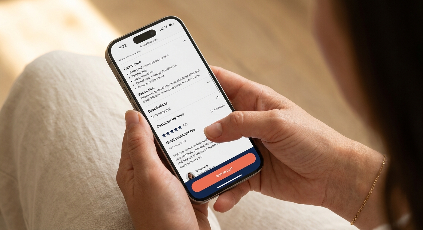
4. Display Star Ratings and Review Count Below the Product Title
The Spiegel Research Center at Northwestern ran a study on this. Products with 5+ reviews are 270% more likely to be purchased than products with zero. Even one review gives you a 76.7% conversion lift. One.
But where you put the stars matters as much as having them. They need to sit right below the product title, visible the second the page loads. Not tucked away in a tab at the bottom.
Some numbers worth knowing:
- Shoppers who interact with reviews convert at 5.6% versus 2.1% for those who scroll past. That’s a 166% difference.
- The sweet spot for star rating is 4.75 to 4.99. A perfect 5.0 makes people suspicious (looks fake, and they’re right to wonder).
- 70% of shoppers want to read at least 4 reviews before they trust a store.
- Somewhere around 26-50 reviews is where you hit the balance between “enough social proof” and “this feels authentic.”

5. Prioritise Photo Reviews Over Text-Only
Visitors who interact with photo and video reviews convert at 5.9% compared to 2.8% for text-only. That’s a 106% lift from the same review, just with an image attached.
77% of shoppers go looking for photos from other buyers. If your review section is walls of text, you’re losing people who need to see the product in someone else’s hands before they commit.
What to do about it:
- Use a review app that puts photo reviews front and centre. Judge.me, Loox, and Stamped all handle this well on Shopify.
- Offer a small discount on the next order in exchange for a photo review. This is standard practice and it works.
- Request reviews via SMS, not just email. SMS gets a 66% higher response rate, especially for photos.
- Put photo reviews in a gallery near the top of the review section, not buried below 50 text reviews.
6. Write Descriptions That Answer “Why Should I Buy This From You?”
I’ve lost count of how many Shopify product descriptions I’ve read that just list specs. Material, dimensions, weight. That’s an ingredient list, not a reason to buy.
The Nielsen Norman Group found that scannable, concise copywriting delivers 124% better usability. Baymard Institute reports that a full 10% of top ecommerce sites still provide inadequate product descriptions. That’s free money sitting on the table.
Here’s how to structure it:
- Open with 1-2 sentences about the benefit or outcome. Not the material. The result.
- Follow with bullet points for specs. People scan bullets longer than they read paragraphs.
- Answer the objections your customers have before they ask. Shipping time, return policy, sizing notes, durability, compatibility. Put it in the description itself.
- On mobile, keep paragraphs to 2-4 sentences. Anything longer is a wall of text on a small screen.
- Description length depends on the product. A $12 phone case needs two sentences. A $400 standing desk needs a full breakdown. Test what works for your price point.
7. Show Shipping Costs on the Product Page
Unexpected shipping costs are the number one cause of cart abandonment. 68% of shoppers say it’s their top reason for bailing. Number one. Not “one of many.” The top reason.
So stop hiding shipping costs until checkout. Tell people on the product page.
- Put the shipping cost (or “Free shipping”) near the Add to Cart button
- If you have a free shipping threshold, show a progress bar: “Spend $23 more for free shipping”
- Stores that offer free shipping see 20% higher conversion rates
- 48% of customers will throw more items in the cart to hit a free shipping threshold, so set yours 15-30% above your current average order value
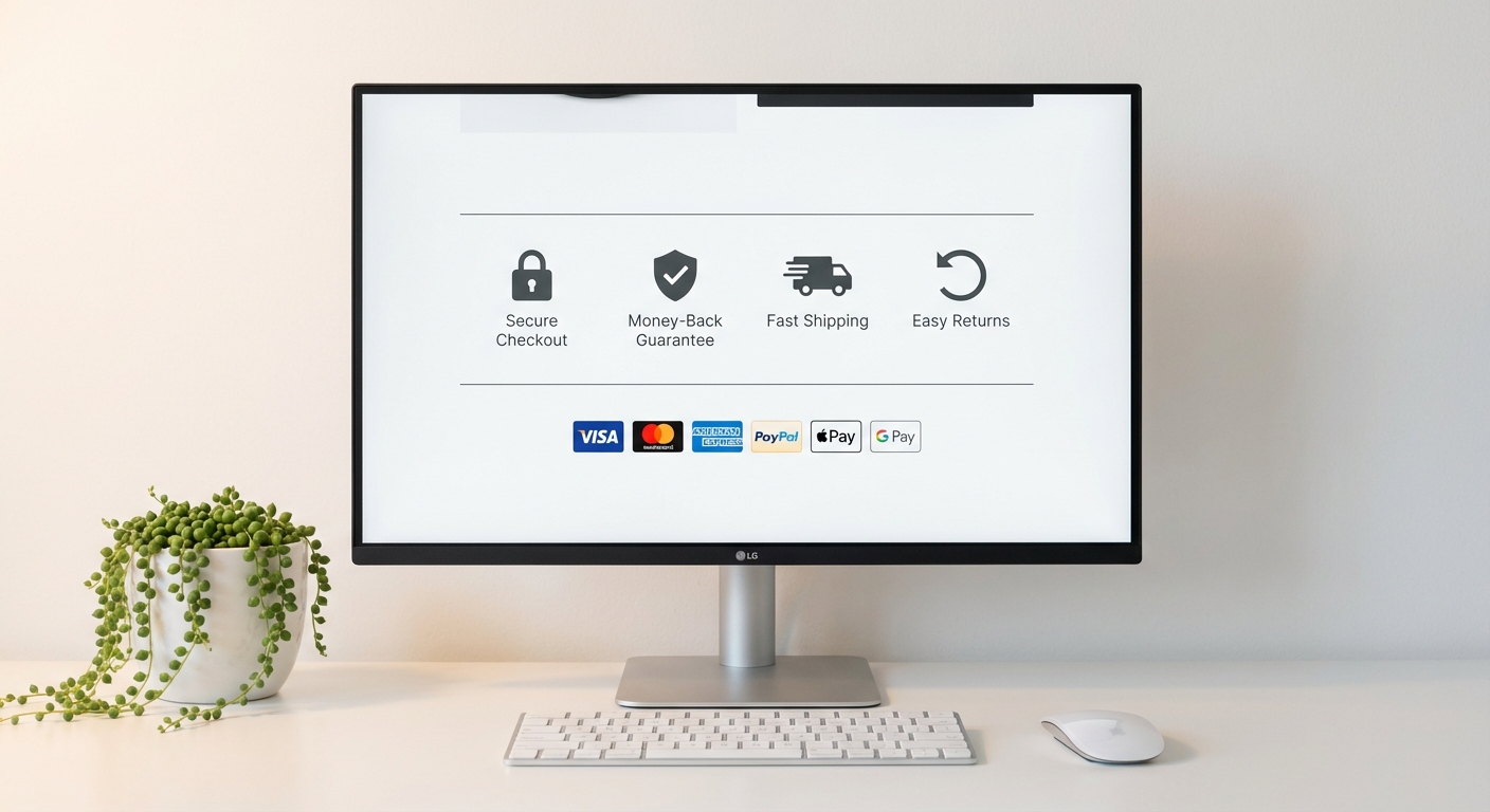
8. Place Trust Signals Near the Add-to-Cart Button
Trust badges lift ecommerce sales by up to 32%. At the same time, 61% of consumers say they won’t buy from a site that has no trust logos visible.
Here’s the catch: where you put them matters more than which ones you pick. A badge in the footer is invisible. It needs to be near the Add to Cart button, right at the moment someone’s deciding whether to commit.
What to show:
- Money-back guarantee badge (one VWO case study showed a 32% conversion increase from this alone)
- Secure checkout or SSL indicator
- Payment method icons (Visa, Mastercard, PayPal)
- A one-line returns summary: “30-day returns, no questions asked”
- Cap it at 3-4 badges. More than that triggers scepticism. Too many badges can drop conversion by 5-8% (called “badge bloat,” and yes, it’s a real thing).
52% of ecommerce sites don’t even link their return policy from the product page. Having one visible puts you ahead of half the market.
9. Make Your Returns Policy Visible and Generous
This deserves its own section, separate from trust badges. 77% of consumers factor the return policy into their purchase decision. And 92% say they’re more willing to buy again from a store that makes returns easy.
- Add a “Returns & Refunds” section on the product page itself. Not a link to a separate policy page buried in the footer.
- Use collapsible content if you’re tight on space. But make sure the heading is visible without expanding anything.
- After page speed improvements, making your shipping and returns info clearer and more visible tends to produce the next biggest conversion lift for most stores we work with.
10. Enable Express Payment Options
Shop Pay delivers 91% higher mobile conversion and 56% higher desktop conversion versus standard Shopify checkout. If you haven’t turned it on, that is the single easiest win available to you right now.
Apple Pay, Google Pay, and PayPal Express reduce friction even further.
- Turn on Shop Pay, Apple Pay, Google Pay, and PayPal in your Shopify Payments settings
- Show express checkout buttons on the product page, not just at checkout
- Shop Pay converts 50% better than typical guest checkout. Your customers don’t need a Shopify account for it. They just need a saved payment method.
11. Fix Your Page Speed (Every 100ms Counts)
A 1-second delay in mobile page load can cause up to a 20% drop in conversions. Google and Deloitte ran a joint study and found that even a 0.1-second improvement translates to an 8.4% conversion increase for ecommerce.
A site that loads in 1 second converts at 2.5x the rate of one loading in 5 seconds.
Quick wins for Shopify product pages:
- Compress images to WebP format (25-34% smaller than JPEG at the same visual quality)
- Turn on lazy loading for images below the fold (up to 30% faster initial load)
- Audit your installed apps. Every app can inject scripts that drag down your product page. If you’re not using an app, remove it.
- Check your Core Web Vitals: LCP under 2.5 seconds, INP under 200ms, CLS under 0.1
12. Use Real Scarcity (Never Fake It)
Showing true stock counts has lifted conversion rates by up to 17.8% in controlled studies. Countdown timers on genuine limited-time promotions show a 10-20% increase in product page conversions.
But fake scarcity destroys trust. Timers that reset every time you refresh, permanent “Sale ending today!” banners that have been up for six months, “Only 2 left!” on products sitting in a warehouse with 500 units. Shoppers notice. Bounce rates go up.
What works:
- Connect your stock indicator to real inventory data. “Only 3 left” works when it’s true.
- Countdown timers for genuinely time-limited promotions only. Seasonal sales, product launches, that kind of thing.
- Pair scarcity with social proof (“12 people bought this today”). The combination can push conversion up by as much as 40%.
Where to Start If You’re Below 4.6%
You don’t need to do all 12 at once. If your add-to-cart rate is sitting below the 4.6% average, start here:
- Turn on express checkout buttons. Lowest effort, highest return.
- Put shipping costs and your return policy on the product page. This fixes the number one abandonment trigger.
- Collect your first 10-20 photo reviews. Social proof compounds over time, and you need to start somewhere.
The stores that beat benchmarks month after month aren’t running some secret playbook. They’ve just gone through their product pages and removed the things that get in the way of someone clicking Add to Cart. Every percentage point improvement in that rate drops to your bottom line. If your add-to-cart rate is healthy but sales still aren’t following, the problem is further down the funnel. If visitors aren’t reaching your product pages at all, product page SEO and your collection pages are the place to start.
We’ve helped Shopify stores increase their conversion rates by an average of 93%. If you want to know where your product pages are losing revenue, our CRO service can help. Book a free strategy call and we’ll walk you through it.